
It’s easy to fall into the trap of thinking that a website is just a website and that all sites are pretty much the same. While that might once have been true, the Internet changes fast and in recent years the requirements for websites have changed with it.
More and more of us are accessing the web via mobile devices like smartphones and tablets. Indeed many people skip the desktop altogether and their only experience of the Internet is on mobile. The smaller screens of these devices mean that traditional websites don’t always display to their best advantage. If your site is to work in the era of mobile Internet it needs to be able to be able to display properly on any device.
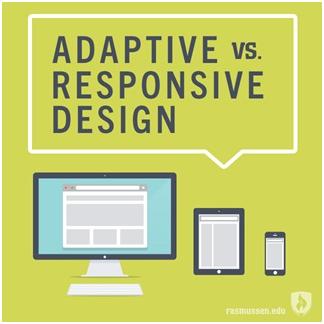
Adapt or Respond?
To be effective in the mobile age a website needs to change to suit the device it’s being viewed on. There are two main ways of doing this, the first is called ‘responsive’ web design. In a nutshell a responsive site is able to detect the type of device it’s being viewed on and display accordingly, so no longer will visitors see a tiny version of the desktop site that they have to zoom in and shunt around in order to read.

Responsive design delivers all of the site’s code to the device and the processor in the phone or tablet does the work of displaying the pages correctly. It’s important that during the design stage the site is properly checked to ensure that it displays well on various different types of device. Companies like Bug Finders who offer software testing can help to ensure that this is the case.
The alternative approach is ‘adaptive’ design. This works by detecting the device when the site is requested and before it’s delivered and then only sending the parts needed to display it on a particular system. The advantage of this is that because the work is done on the server less code needs to be sent to the device so load times are quicker. It also means that less data is being sent, important for users of mobile networks who may have a limited data allowance.
Is a Redesign Needed?
If your website is a few years old then it may be time for a fresh look anyway. In this case redesigning the site using the latest responsive or adaptive principles and running it through software testing services to ensure it’s effective is going to be worthwhile.
With a more recent site it may be possible to adapt it to become compatible with a wider range of devices at minimal cost. Either way you should think of it as an investment, you could leave your site alone and let potential customers struggle to read it on their smartphones, but if you do that they’re more likely to go off and buy from someone else who does have a site that displays well on their device.